For 17 years, we worked to preserve the rich heritage of this nearly two-century-old brand while reinterpreting it through a contemporary lens. Rather than positioning ourselves solely as an “advertising agency,” we acted as a strategic and creative partner, accompanying Beyaz Fırın throughout its transformation journey.
When our collaboration began in 2008, the first step was a comprehensive brand identity renewal process—aimed at modernizing the brand without compromising its historical depth. Together, we built the core narrative that bridges past and present through the slogan “A Two-Century-Old Story of Flavor.”
From in-store displays to campaign visuals, seasonal communications to printed materials, we designed a warm, inviting and appetizing visual world where sweet and savory coexist side by side.
Suadiye
Ataşehir
Akasya AVM
Erenköy
Kadıköy
Etiler
Kanyon
Göktürk
Moda
Nişantaşı
İstinye
Mall of Istanbul
Kızıltoprak
BiDolu Puan
For Beyaz Fırın’s loyalty program, we developed a name, logo and a modular visual interface fully aligned with the brand’s overall identity. From naming and logo design to UI and communication materials, a consistent and cohesive system was established across all touchpoints.
New Year Concepts
Since 2008, we have created dedicated New Year concepts for Beyaz Fırın every year. During this highly active period—starting in mid-November and running through the end of December—we handled the entire process end-to-end, including defining the New Year concept, planning and executing photo shoots, designing packaging for special seasonal products, creating catalogs used across both print and digital platforms.
Although Valentine’s Day is a single date on the calendar, it has always been a thoughtfully prepared occasion for Beyaz Fırın. Specially shaped cakes, chocolates and macarons were brought together with a season-specific visual language and custom packaging—creating a strong uplift in both sales performance and brand appreciation.
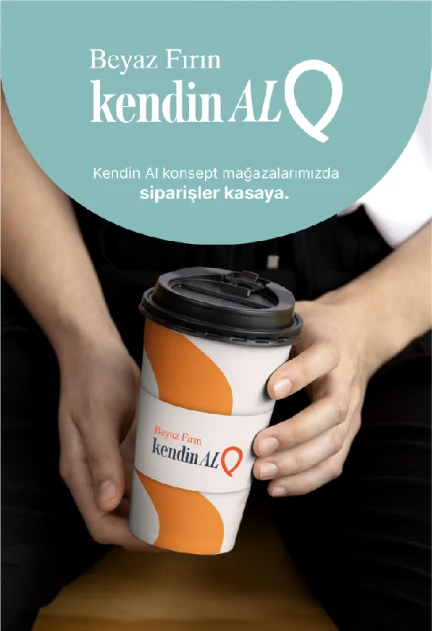
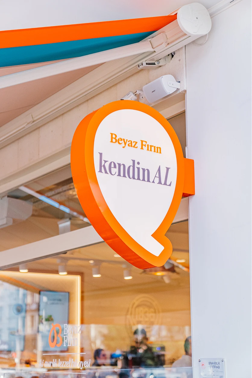
The Kendin Al (Self-Serve) concept was developed for Beyaz Fırın’s self-service stores located at key points in the city, and brought to life in İstinye and Kızıltoprak. Karbon provided end-to-end support, from concept naming and logo design to wayfinding, infographic storytelling and communication language.
Ice Cream
Producing all of its products in-house, Beyaz Fırın approached ice cream as a signature product developed with its own recipes. As one of the first brands in the pastry sector to offer ice cream without refined sugar, Beyaz Fırın consistently positioned the product in a distinctive category with its unique flavors.
Karbon designed the ice cream concept’s logo and color language, graphic world, in-store visual applications and communication materials.
Web Design
Beyaz Fırın entered e-commerce in 2009 and gradually expanded both its product range and service network. In parallel with this growth, Karbon designed the evolving website’s visual language—placing user experience and brand consistency at the center of the digital journey.
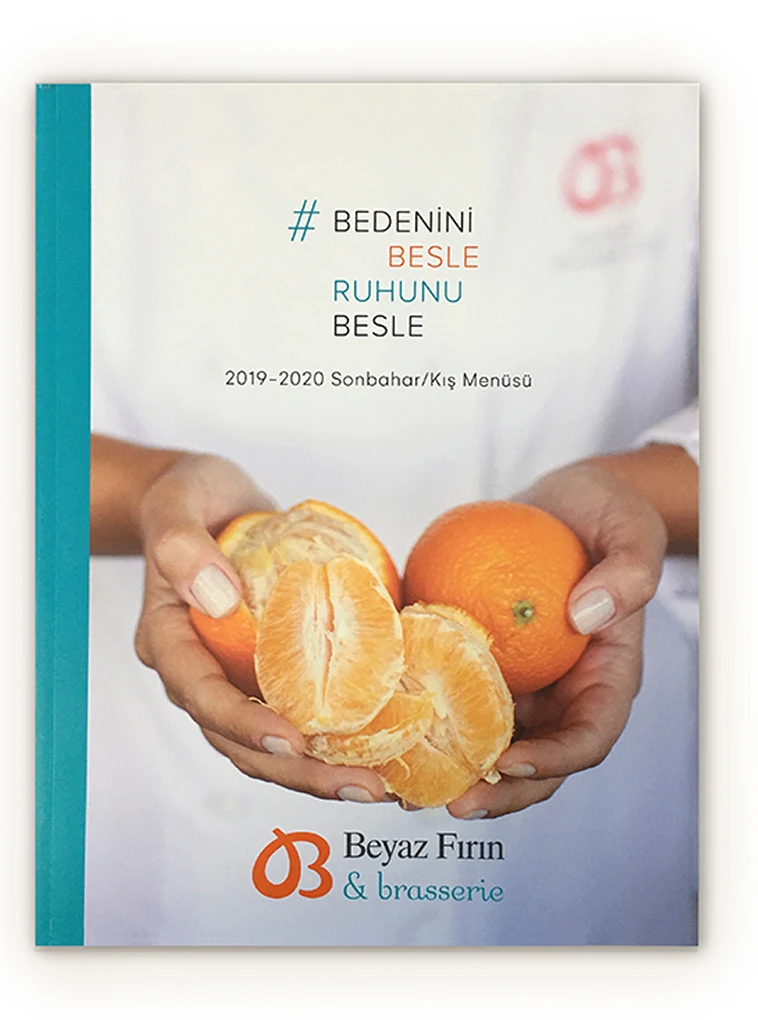
Menu
Over time, Beyaz Fırın menus evolved from simple price lists into brand publications that tell the story of the products. Within a structure that prioritizes ease of choice, the menus were designed to showcase products through photography, clearly communicate ingredients and content, highlight the brand’s local producer mindset and healthy nutrition philosophy, use infographics and concise informational texts.
Across the years, Beyaz Fırın menus became a format enjoyed not only by customers but also followed with interest by industry professionals, growing stronger and more refined with each edition.